Note: Good-looking text flow
If you want your text to flow nicely on responsive web sites, there are two tricks I like to use: soft hyphens for optional break points, and text-overflow ellipsis for situations where there is only room for a limited amount of text.
One at a time, now.
Soft hyphens #
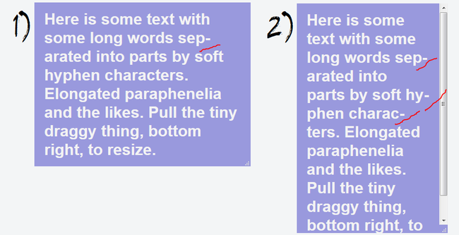
A soft hyphen ­ is an optional breakpoint for a word. The browser will determine, when layouting, if this breakpoint should be used. If the word extends across the right-most side of the box it is in, it will break.
I made a quick little example with a resizable box that lets you see the effect.
This will also work as your layout shrinks and grows, making your text look good, with text lines of similar length.
We used this on Mærkelex to make sure the names of badges were always readable, even at very dynamic sizes of containing divs:
Text-overflow #
You probably know about the CSS attribute overflow. It lets you simply hide anything overflowing a certain element’s boundaries.
The text-overflow attribute lets you decide what to do with text that vertically exceeds its bounds. That is to say it will not work on text exceeding the bottom of a box.
I do often find that I will tease a single line of text (preview of a description?) in an element that changes size.
Unlike backend truncate functions, this method will have the browser determine, at the time of layouting, where to stop the string and replace it with a stopping character or string.
I made a small example showing how the browser will naturally select where to end the string, and insert an ellipsis.
Setting text-overflow: ellipsis; gets the effect I showed in the above example. Alternatively, a custom string may be used. This is how it would look with text-overflow: "EOF";:
When I write more, filling out this form will let you know.


